Bayangkan dua orang berdiri sejajar di depan Ka’bah. Satu adalah pengusaha sukses dengan deretan gelar di belakang namanya, satu lagi adalah pekerja harian yang menabung bertahun-tahun untuk bisa berada di sana. Begitu mereka mengenakan kain ihram, perbedaan itu lenyap. Tidak ada jas, tidak ada seragam, tidak ada simbol status — hanya dua lembar kain putih dan satu tujuan yang sama: mendekat kepada Allah SWT.
“Ihram menghapus sekat antara manusia, menyisakan hanya ketundukan dan ketulusan di hadapan Allah.”
Itulah salah satu keajaiban kecil yang sering terlewat ketika orang membicarakan umroh. Banyak yang menganggapnya sekadar perjalanan ke tanah suci, agenda spiritual yang dicatat lalu dilupakan setelah pulang. Padahal, setiap rukun dalam ibadah umroh adalah pelajaran hidup yang dirancang untuk membentuk karakter kesabaran, keikhlasan, dan ketaatan jauh setelah jamaah melepas kain ihramnya.
Ihram: Saat Status Sosial Kehilangan Maknanya
Ihram adalah gerbang pembuka ibadah umroh, dimulai dengan niat yang tulus dan pakaian yang sederhana. Laki-laki mengenakan dua lembar kain putih tanpa jahitan, sementara perempuan mengenakan pakaian yang menutup aurat sesuai syariat. Tidak ada model atau merek tertentu yang membedakan satu jamaah dari yang lain.
Di sinilah letak hikmahnya: ihram menghapus sekat antara kaya dan miskin, pejabat dan rakyat biasa. Semua orang berdiri setara sebagai hamba yang sama-sama mengharap rahmat dan ampunan Allah SWT.
- Kesederhanaan
- Kesetaraan
- Keikhlasan dalam niat
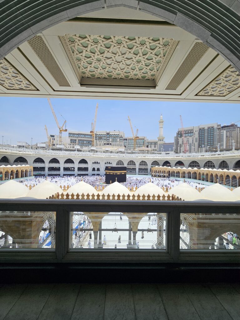
Tawaf: Konsistensi Yang Tidak Pernah Berhenti
Setelah berihram, jamaah melaksanakan tawaf mengelilingi Ka’bah sebanyak tujuh putaran. Gerakan yang terus berulang ini bukan sekadar ritual fisik, tetapi simbol ketaatan seorang muslim terhadap aturan Allah dan Rasul-Nya.
Tawaf juga mengajarkan satu hal sederhana namun dalam: segala sesuatu dalam hidup seharusnya berputar pada satu poros yang benar, yaitu jalan yang diridhai Allah SWT.
“Ketika arah hidup mulai melenceng, tawaf mengingatkan kita untuk kembali ke pusat yang sama.”
Sa’i: Perjuangan Yang Tidak Pernah Sia-Sia
Rukun berikutnya adalah sa’i, yaitu berjalan dan sedikit berlari kecil antara Bukit Shafa dan Bukit Marwah sebanyak tujuh kali. Gerakan ini mengenang perjuangan Siti Hajar yang berlari demi mencari air untuk putranya, Nabi Ismail a.s.
Sa’i mengajarkan bahwa kehidupan menuntut kerja keras, dan di tengah kesulitan sekalipun, seorang muslim diajak untuk tetap optimis karena pertolongan Allah selalu datang bagi hamba yang bersungguh-sungguh berusaha.
- Usaha yang sungguh-sungguh
- Kesabaran dalam ujian
- Optimisme terhadap pertolongan Allah
Tahallul: Penyucian Yang Dimulai Dari Diri Sendiri
Tahallul menjadi penutup rangkaian rukun umroh, ditandai dengan mencukur atau memotong sebagian rambut sebagai simbol membersihkan diri dari dosa dan kesalahan. Tindakan sederhana ini membawa pesan besar: nilai seseorang di sisi Allah tidak ditentukan oleh penampilan fisik, melainkan oleh ketakwaan dan amal baiknya.
Lebih dari Sekadar Perjalanan Fisik
Jika dirangkum, setiap rukun umroh membawa pesannya sendiri:
- Ihram — mengajarkan kesederhanaan dan kesetaraan
- Tawaf — mengajarkan ketaatan dan istiqamah
- Sa’i — mengajarkan perjuangan dan kesabaran
- Tahallul — melambangkan penyucian diri
Karena itu, umroh sejatinya bukan hanya soal menyelesaikan rangkaian ritual, melainkan soal membawa pulang maknanya. Seseorang yang memahami hikmah di balik setiap langkahnya akan kembali dari tanah suci bukan hanya dengan gelar “telah berumroh”, tetapi dengan pribadi yang lebih sabar, lebih ikhlas, dan lebih taat jauh setelah kain ihram itu dilepas.